|
<Previous
Next>
Too Clever by Half?

I always like when electronic components are used to for a picture.

Who doesn't love good nerd humor? Linx Technologies hit a home
run with these banner ads, IMHO. (added 1/8/2013)

The "back of a napkin" brainstorm-turned-product image has always
been appealing to me. This ad does a good job of capturing the idea.

As the saying goes, "Brevity is the soul of wit."
This ad proves it.

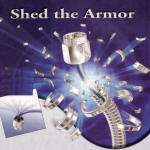
I have always thought this was one of the cleverest ads around.

A more appropriate image to go with the title would be a cable
in a snake form shedding its skin, but most people would not appreciate a snake.
As one who has worked with metal armored cables, any means of getting rid of the
metal is a welcome sight.

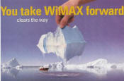
I hate to be the one to point this out, but in these times of
manic concern over global warming and melting glacier mass, doesn't this seem to
suggest that the company views the holy ice as an impediment to mankind's progress?
Just asking...
From a strictly scientific standpoint, that ice floe appears
to have its volume evenly distributed above and below the water line. My schoolbooks
say 7/8 of the mass would be under water.

The jury is still out on this one - could easily fall into the
too-clever-by-half category.

This one I like - simple, but effective. We techies speak of
"learning curves" all the time, and often draw a plot in the air with our fingers
while doing so.

Yeah, the metaphor is correct, but for some reason it offends
me.

A transformation from a paper airplane to a supersonic fighter.
Maybe it's a personal thing since I am an airplane hobbyist.

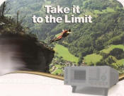
This should appeal to BASE jumpers and other extreme sports types.
B=Building, A=Antenna tower, S=Span (bridge), E= Earth

This is an unexpected metaphor that, perhaps the only reason
I like it because I appreciate fine woodworking, and Melanie plays the violin.

This is just plain funny - too ridiculous to be real, but then
that's why it's funny.
Here is an indisputable fact: Most people are not willing to pay any amount for
non-essential items they consider to be intangibles. That is to say if such an item
is not regarded as having trading or bartering value, then there is usually resistance
to paying for it. The behavior is particularly applicable to printed material (information),
be it physical in the form of a magazine, or virtual in the form of a webpage. I
am that way, and my guess is that you are, too.
Now, just because we are not willing to pay for access to certain information
does not mean that we do not want to consume what is being offered, we simply do
not care to trade our hard-earned income for it. That is where advertising comes
into play. Television (over-the-air) and radio (AM & FM) broadcasts, websites,
trade magazines (EE Times, Microwaves & RF, High Frequency Electronics, etc.),
neighborhood sporting events, and many other venues that we access on a regular
basis have costs entirely underwritten by companies willing to pay to have their
message presented to that portion of the public benefitting from its investment.
RF Cafe is such a venue.
An argument can be made that just because you do not have to shell out money
from your pocket for access, there is actually a price being paid in the form of
inconvenience. The presence of advertisements does create clutter and a distraction
from the main topic of your interest. Mental processing time is required to separate
the information from the "noise." In the case of radio and television, you must
endure dedicated segments of advertising (or go do something else), while printed
forms are more of a multitasking (even subconscious) effort. As much as advertising
can be considered a nuisance, it obviously performs a needed function or it would
have disappeared long ago. The fact is that almost all companies (those still in
business, anyway) have something that people want or need, so other than word-of-mouth,
advertising is necessary. In many situations, particularly in professional environments
where vital information is needed to be successful, discovering a new opportunity
by virtue of an advertisement can be a (figurative) life saver.
Companies notoriously have paid huge amounts of money to have advertisements
designed to maximize effectiveness. Most notable are the recent Super Bowl campaigns
where 30-second slots are being sold for millions of dollars. I have never been
a big football fan, but in the last few years I have taken to watching the Super
Bowl just to see the highly touted commercials. Coca-Cola and UPS would love to
read that confession. Occasionally, the intended effect is realized, but often,
IMHO, the advertisements fall way short of the intended outcome. Some are downright
stupid and do more harm than good (like the Budweiser Clydesdale fart being ignited
by the lovers' candle and torching them while they sit in the sleigh). The phrase
"too clever by half" applies for many of them.
The pages of our trade magazines are populated with many types of advertisements;
some are really good, others are really bad, and most are mercifully benign. I tend
to notice the first two types. Below are a few examples of some of the ads that
have stood out for one or the other of the two reasons. Company names and product
identifiers have been removed. I am hoping the "Fair Use" rule applies to my reproducing
part of these advertisements. You will probably recognize many of these. My comments,
for what they are worth, are included.

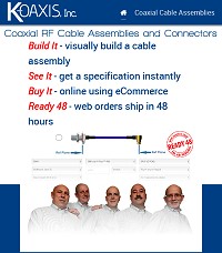
Whether intentional or not, the bald guy lineup is eye-catching!
Put a monocle on the guy 2nd from the left and you'll have
Werner
Klemperer (Colonel Klink of Hogan's Heroes)!

I'm not a cards player, but I think this is a good use of a familiar
theme - not to mention the implication of the waveforms being four aces - the best
possible four-of-a-kind hand to hold

This is another lame attempt at using a metaphor. Sorry - not
impressed.

Very cleverly done - the graphic concisely illustrates the message
using a familiar object. It definitely conveys the idea of the messy results that
can come from a lack of attention to details.

Here is an effective representation of a component "marketplace."

This one is kind of corny, but it does use an appropriate metaphor.

This series of ads is not bad, but there is not a lot of work
that goes into them. The company's previous series with custom artwork was excellent
- particularly their wireless cafe "RF Cafe?" ad.

Kind of funny, but a bit sophomoric, IMHO.

Neither offends nor excites.

Another effective metaphor. Like the nature paintings with embedded secondary
images of animals, you might at first glance miss the city inside
(reminiscent of an old
vacuum tube chassis).

Ewwww.....

Well, maybe if the ringside female support staff associated with professional
wrestling was also included in the image...

I'm guessing the creators of this ad are surfers and hope others
will appreciate the juxtaposing of ideas. Maybe it does.

I remember seeing this kind of thing in a Bugs Bunny cartoon
back in the 1960s - not exactly original.
Send me your candidates with a short blurb about why
you like or dislike them, and I will be glad to include them here (with appropriate
credit).
- Kirt Blattenberger
Posted January 10, 2008
|


 "
"