|
|
|||||||||
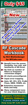
| Software: RF Cascade Workbook | RF Symbols for Office | RF Symbols & Stencils for Visio | Espresso Workbook | ||||||||||
|
|||||||||||||||||||||||||||||||
   |
   |
||||||||||||||||||||||||||||||
|
Please Support RF Cafe by purchasing my ridiculously low-priced products, all of which I created. RF & Electronics Symbols for Visio RF & Electronics Symbols for Office RF & Electronics Stencils for Visio T-Shirts, Mugs, Cups, Ball Caps, Mouse Pads These Are Available for Free |
|||||||||||||||||||||||||||||||


RF Cafe v2012

 "Factoids," "Kirt's Cogitations," and
"Tech Topics Smorgasbord"
are all manifestations of my ranting on various subjects relevant (usually) to the
overall RF Cafe theme. All may be accessed on these pages:
"Factoids," "Kirt's Cogitations," and
"Tech Topics Smorgasbord"
are all manifestations of my ranting on various subjects relevant (usually) to the
overall RF Cafe theme. All may be accessed on these pages:
1 | 2 | 3 | 4 | 5 | 6 | 7 | 8 | 9 | 10 | 11 | 12 | 13 | 14 | 15 | 16 | 17 | 18 | 19 | 20 | 21 | 22 | 23 | 24 | 25 | 26 | 27 | 28 | 29 | 30 | 31 | 32 | 33 | 34 | 35 | 36 | 37
RF Cafe began a makeover on January 1st of this year. It is a long way from being complete. Since its inception in 1999, RF Cafe has grown rather explosively, and during that time thousands of pages of content have been added. The task of compiling and presenting all of the information in a useful manner has become daunting, if not impossible. The biggest criticism I get about RF Cafe is the overall clutter of the pages - way too much stuff crammed into a small area. Trust me, it has bothered me as much as it has you.
I have tried many times to come up with an acceptable alternative for spreading things out that would not cause the page to be 2000 pixels wide or many pages tall, and still be useful. My options have been limited by a combination of not wanting to send visitors multiple layers deep into the site in order to locate targeted data, not wanting to implement unreliable dropdown type menus (still not enough standardization to work consistently across browsers and platforms), and most importantly not having the freedom to reconfigure the entire web page layout because of commitments to advertisers who were paying hard-earned money to appear in specific locations on the page. At great financial risk, I made the command decision to change that last restriction at the beginning of 2012. Doing so was key to being able to accomplish everything else.
Some of the changes are immediately obvious to the casual observer, like the total absence of banner ads in the right page border. However, there is a lot more to it than that. Up until midnight of December 31, 2011, I had a total of eight privately-sponsored banner ad slots on every RF Cafe page: two 120x600-pixel banners in the left border, two 160x600-pixel banners in the right border, one 468x60-pixel banner directly under the top menu, and one 300x250-pixel banner in the body of every page (usually in the upper right-hand corner). Some pages also had a 300x250-pixel Google Ad buried elsewhere on the page and a 468x60-pixel Google Ad in the bottom page border. That is a lot of ads, but no more than most news and information websites. One thing I have never done - and never will do - is blast you with one of those highly obnoxious full-page or overlay ads that appear upon first visiting a website. I hate that. At present, there are at least three fewer ads per page, so that is the first step.
One result of having Google serve the banner ads is that more companies will have the opportunity to be represented on RF Cafe. Believe it or not, I have always had a waiting list of companies that wanted to occupy a banner slot when it became available. My policy has always been to allow a company to remain in a slot for as long as they want. I often receive feedback that RF Cafe advertising provides that best bang for the buck compared to any other venue either in print or on the Internet. My rates were ridiculously low (I've been called a better engineer than businessman). My biggest concern about having the same advertisers in the same slots was the well-documented "ad blindness" phenomenon where after repeatedly being presented with the same image time after time, it effectively would become invisible to the reader. I am hoping the new layout will provide a greater variety of useful options to visitors.
At least one former banner advertiser has figured out that the Google AdWords program has a targeting capability where you can specify where you would prefer your ad to be displayed, rather than just allowing their system to do it for you. That company's ad has already appeared multiple times in the 160x600-pixel banner slot in the upper left side of the page. I'm hoping some of the others will give it a try as well.
Another major effort for 2012 is going to be trying to get a more interaction with visitors. The RF Cafe Forums have been around since about 2005, and they used to get a fair amount of activity. In the last couple years, postings have dropped off considerably. I'm guessing a lot of it has to do with the advent of social websites providing an alternate venue for idea exchanges, but probably the biggest obstacle has been the restrictive registration process. Because of flooding by roving spam bots, I had to implement a registration process where someone had to send me an e-mail requesting a user name and password. Nobody really wants to go to that trouble, so the forums suffered. Just yesterday I installed an upgrade that hopefully will hold down the number of spam bot registrants while allowing people to register themselves without having to contact me. I also placed in the right page border some code that displays the most recent 5 posts in the Employment forum area and the most recent 5 posts for the remaining areas of the forums. We'll see how that goes.
Another option for social interaction is placing comments areas directly on every page, but that is kind of cumbersome and it takes up a lot of space on a page. Facebook has easy-to-implement applets for using their interface, including sign-in, for following comments. I tried it for a couple days and only had one response, so I removed it. Some of the major news websites use paid commenting systems like Disqus that accommodate sign-in from most of the social networking hosts like Twitter, Facebook, Yahoo, et al. While I am not averse to paying for a service, it would be preferable to figure out how to expand on the in-house forum if possible.
Tackling the menu layout at the top of the page is the next big hurdle. When I generate an XML sitemap to submit to the search engines, more than 6,300 pages are included. That is after I recently deleted a couple hundred obsolete pages. How do you sufficiently provide navigation to that many pages without overwhelming the reader with options? Sure, most can be grouped into general categories and subcategories and sub-subcategories, but there simply is not enough space available, and the reader would not tolerate so many options when he/she is likely only interested in a specific topic. Even those who have time to explore don't want to be inundated with endless layers of menus or content trees. My solution, if you can call it that, is to include what I consider to be some of the main top-level items, and then direct people to the Search box for specific inquiries. Most of the big search engines are aware of just about every page and image on RF Cafe. Still, something better than what I have is needed. That top region will be going through multiple iterations over the next couple months.
Page content areas will not be all that much different other than the removal of the big 300x250-pixel banner ad from the upper right corner. It has always bothered me to have to force the most important part of the page content to wrap around the big box since it upsets the symmetry of the page right away. Now, in most cases the 300x250-pixel ad is located farther down the page, out of the primary content. Sometimes it even put it at the bottom if there is no reasonable way to squeeze it in elsewhere.
Throughout 2012 I plan to focus on improving the visitor experience in order to encourage repeat visits and interaction. I have read many articles on website design and search engine optimization strategies. I know what people want (according to the experts, anyway); now it's just a not-so-simple matter of doing it.
Suggestions are welcome.
Posted January 19, 2012

Copyright: 1996 - 2026 |
About RF Cafe RF Cafe began life in 1996 as "RF Tools" in an AOL screen name web space totaling 2 MB. Its primary purpose was to provide me with ready access to commonly needed formulas and reference material while performing my work as an RF system and circuit design engineer. The World Wide Web (Internet) was largely an unknown entity at the time and bandwidth was a scarce commodity. Dial-up modems blazed along at 14.4 kbps while tying up your telephone line, and a lady's voice announced "You've Got Mail" when a new message arrived... |
Copyright 1996 - 2026 All trademarks, copyrights, patents, and other rights of ownership to images
and text used on the RF Cafe website are hereby acknowledge My Hobby Website: My Daughter's Website: |