|
Quite a few articles
on color television were published in trade and hobby magazines in the 1950s
and 1960s as the technology was adopted and fine tuned. The electronic circuitry
aspect of transmitting and receiving chromaticity, intensity, synchronization,
and audio was impressive, but the science that went into color research was
equally amazing. As with so many things we take for granted because someone
else did all the hard work of figuring out how to make something work and then
making it available to us at an affordable price, the physics of human color
perception needed intense study in order to produce a pleasing image on the
cathode ray tube (CRT). The key to understanding color is the
chromaticity diagram, based in the
human tristimulus
color space, which is described in detail herein. It concludes with a triangle
superimposed on the chromaticity diagram indicating the region occupied by the
color range available for a given CRT based on phosphor type and electron gun
energy.
Part 1. Color fundamentals and their application in color television for
radio and TV service technicians.
 By Milton S. Kiver By Milton S. Kiver
Pres. Television Communications Institute
Color forms one of the most intimate contacts in our everyday life - we wear
colored clothes, we use colored objects, we live in colored houses, and we eat
colored food. Yet, in spite of this close contact with color, most people have
only a casual knowledge of the nature of color or of color mixing. To the television
technician, color possesses added significance because of its application in
color television. Such terms as color primaries, hue, saturation, chromaticity,
and luminance will be commonly used in any description of a color television
receiver, both from the standpoint of operation and of service. What do these
words mean? How do they tie in with color television? These are some of the
questions the service technician will be confronted with and now, while the
art is still young, is as good a time as any to learn about them.
Editor's Note
Although color television is a commercial reality, few TV service technicians
will have the opportunity to install or work with sets for some time to come.
In the meantime, the service technician can ground himself thoroughly on the
fundamentals of the subject so as to be prepared when color TV sets become
widely available. This article is the first of a series that will attempt to
present all the background necessary for the servicing of color TV receivers.
Actual schematic diagrams of color TV sets will be analyzed when they become
available and once the fundamentals of color TV have been thoroughly covered.
Of course, other articles in Radio & Television News will present the latest
advances in color TV as they occur.
Let us start off with color primaries. Anyone who has ever experimented with
projector lamps has discovered that when different colored lights from several
projectors are combined, the resultant color seen by an observer will differ
from the color of any of the projected beams. Thus, for example, yellow can
be formed by combining red and green light; white light can be produced by combining
red, green, and blue. The color of the light formed will appear to the eye as
a complete color and the eye will be unable to distinguish the various components
of the mixture that united to form the new color.
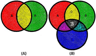
Fig. 1 - (A) A new color is formed between color "A" and
color "B" as a result of mixing color "A" and color "B". (B) Adding three original
colors, "A", "B", and "C", results in four new ones.

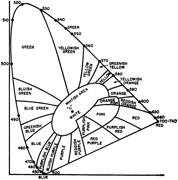
Fig. 2 - A chromaticity diagram. See text for details.
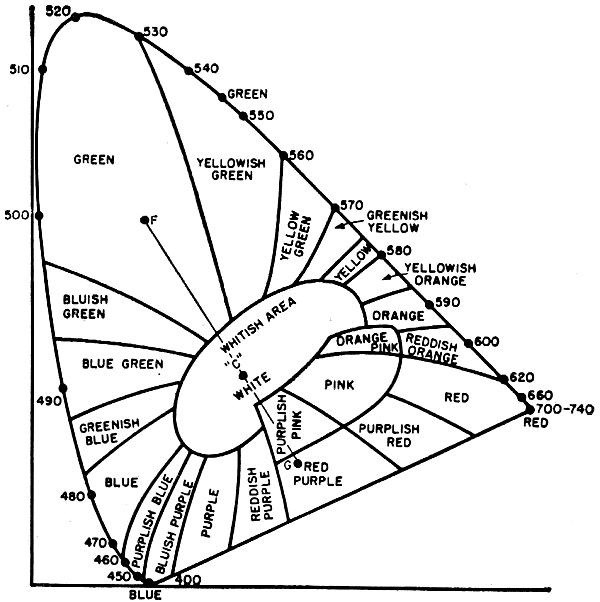
Fig. 3 - The line drawn between points "R" and "G" passes
through all the colors that can be obtained by mixing these two shades of the
red and green hues.

Fig. 4 - When moving from "A" to "C," the green becomes
less and less saturated, or lighter in intensity.

Fig. 5 - Colors "F" and "G" will produce white when mixed
in proper proportions; they are complementary.
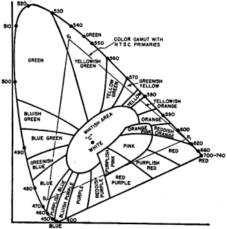
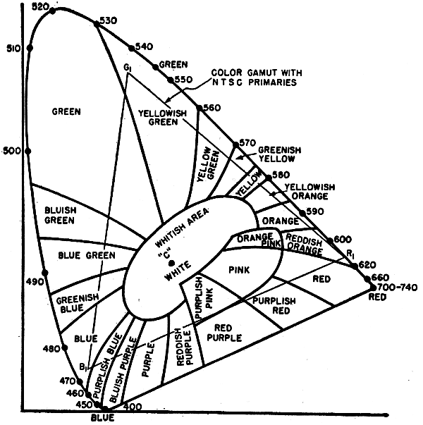
Fig. 6 - Within the triangle are the colors that can be
seen on a color TV screen.
This method of color formation is illustrated in. Fig. 1A. Two circles of
colored light are projected onto a screen and positioned so that they overlap
to some extent. Within the overlapping region, a new color will be produced
by the addition of color "A" and color "B." Where the circles of light do not
overlap, each light will retain its original color. If a third circle of light
is added, as shown in Fig. 1B, then a maximum of seven colors can be obtained.
These would be: color "A" color "B" color "C" color "D" (formed from "A" and
"B"), color "E" (formed from "A" and "C"), color "F" (formed from "B" and "C"),
and color "G" (formed from "A," "B," and "C") - and each would differ from the
other. In the areas where the circles of light overlapped, the eye would not
be able to distinguish each of the colors forming the mixture, but instead would
see the final color produced. Thus, color "A" and "B" would not appear to the
eye as color "A" and color "B," but as some new color which we can call color
"D." The same would be true of each of the other combinations.
The number of different colors that can be formed by the use of three colored
lights, as shown in Fig. 1B, will depend upon the colors chosen. Experience
has indicated that the colors red, blue, and green, when combined with each
other in various proportions, will produce a wider range (or gamut) of colors
than any other combination of three colors. Note, however, that if we used four
different colors in our mixing process, we could produce an even greater number
of different colors. With the addition of more and more colors to our mixing
scheme, the reproducible range would widen somewhat. Obviously, however, a line
must be drawn and the use of three colors has been standardized. The three colors
chosen, red, green, and blue, are thus referred to as the "primary" colors although,
as we shall see, the use of the word primary has been widely misinterpreted
to mean that red, green, and blue will, in various combinations, reproduce all
colors. This is only in a special instance.
The reason why three primaries were chosen, in preference to say four, probably
stems from the belief that the eye behaves as though it contains three sets
of nerves, with each set of nerves responsive to a different portion of the
visible spectrum. Thus, one set of nerves has its greatest sensitivity in the
blue region; another set is most sensitive in the green region; and the third
set is most sensitive to red. Whether or not three sets of nerves actually exist
has never been absolutely established. However, since the eye reacts as though
such a condition does exist, it is reasonable to work on the assumption that
it does.
The theory which serves to explain the ability of the human eye to distinguish
various colors can also be employed to explain color blindness. In the eyes
of a color-blind person. all of-the color sensitive nerves or retinal cones
react in the same way to all colors. Hence, when colored light is viewed by
these people, all three sets of nerves are similarly stimulated and the same
result is obtained as though equal amounts of red, green, and blue light were
intermixed. The color seen would be white, or some intermediate shade of grey.
These people can distinguish between dark and light, but no more.
There are also people whose retinal cones differ sufficiently to see some
of the colors, but not all. These people are known as partially color blind.
Perhaps the best known instance of this is green and red color blindness. In
the eyes of these people green or red appears grey. Fortunately, however, over
90 per-cent of the population have normal vision, which means that they are
able to distinguish between all of the spectrum colors.
A diagram which is very convenient to use for color mixing is the tongue-shaped
(or horseshoe-shaped) curve shown in Fig. 2. (Another name for this curve is
chromaticity diagram.)
Around the perimeter of this curve are listed numbers that range from 400
at the lower left-hand corner to 740 at the farthest point to the right. These
figures represent the wavelength of various spectrum colors in millimicrons.
Thus, purple (violet) extends from approximately 400 to 450, blue extends from
450 to 500 millimicrons, green extends from 500 to 570 millimicrons, yellow
extends from 570 to 590 millimicrons, orange extends from 590 to 610 millimicrons,
and red extends from 610 to 740 millimicrons.
Any point not actually on the solid-line curve but within the diagram represents
not a pure spectrum color but some mixture of spectrum colors. Since white is
such a mixture, it, too, lies within this diagram; specifically, at point "C."
This particular point was chosen at an international convention in England and
is generally referred to as "illuminant C." Actually, of course, there is no
specific white light, since sunlight, skylight, and daylight are all forms of
white light and yet the components of each differ considerably. The color quality
of a conventional black-and- vhite television receiver tube is represented by
some point in the central region of the diagram about point "C."
The chromaticity chart lends itself readily to color mixing because a straight
line joining any two points on the curve will indicate all the different color
variations that can be obtained by combining these two colors additively. Thus,
consider a line drawn connecting points "R" and "G" representing certain shades
of red and green respectively. See Fig. 3. If there is more red light than green
light, the exact point representing the new color will lie on the line, but
be closer to "R" than "G." Point "R1" might be such a color. On the
other hand, if a greater percentage of green light is employed, the color will
still lie on the line connecting "R" and "G," but now, it will be closer to
"G" than "R." Point "G1" might be such a color. This same line of
reasoning can be carried out for any two colors on the chart.
(On the screen of a three-gun tri-color picture tube we can carry out the
same experiment by turning off the blue gun and permitting only the electron
beams from the green and red guns to reach the phosphor-dot screen. As one beam,
say that from the red gun, is made more intense, the resultant color on the
screen shifts closer to. red. On the other hand, if the red gun is turned down
and the green gun beam is turned up, the resultant color takes on more and more
of a greenish cast. When both guns are producing beams of equal intensity, yellow
will be seen.)
Point "C," in the central region of this diagram, is taken to represent white
or daylight. If we draw a line between point "C" and any point around the curve,
we have a mixture of white light and a particular spectrum color. Thus, in Fig.
4, a line connects point "C" and green at 545 millimicrons (point "A"), indicating
a mixture of white light and spectrum green. If the amount of white light is
zero, then the pure spectrum green will be produced. As white light is added,
the hue of the green changes and the point representing this mixture moves along
the line toward point "C." We might consider this as diluting the green, causing
it to become lighter and lighter.
(In a color tube, we dilute a solid color, say green, by adding more red
and blue. The red and blue combines with some of the green to form white, thereby
reducing the intensity or depth of the green.)
It is possible to specify the saturation of a color by its distance from
point "C." Thus, consider point "B" in Fig. 4. This is half way between point
"C" and point "A" and represents a mixture of green diluted 50 per-cent with
white light. The saturation of the green at point "B" is 50 per-cent. Had the
distance between point "C" and point "B" been 75 per-cent of the total distance
between point "C" and point "A," we would have stated that the saturation of
the color at point "B" was 75 per-cent. By moving point "B" closer and closer
to the spectrum curve, its purity increases until it becomes 100 per-cent at
the curve-point "A." By moving point "B" closer to point "C," its saturation
decreases. At point "C," the saturation is said to be zero.
In connection with saturation, the word hue is frequently heard. Hue represents
colors such as red, green, orange, etc. It is associated with color wavelength
and when we label a certain color as green, or orange, or red, we are specifying
its hue. Thus, hue refers to the basic color as it appears to us, while saturation
tells us how deep the color is. If the color is highly saturated we say that
it is a deep color, such as deep red, or deep green. If it contains a considerable
amount of white light, we say it appears faded or pale, as a faded red or a
pale green. Hue and saturation are psychological terms representing the observer's
impression of a color and hence they can-not be defined as precisely as wavelength.
At the bottom end of the chromaticity curve, on the line drawn from deep
blue to red, there is a series of colors which are combinations of red and blue
in various proportions. These range from bluish purple to purplish red. It can
be seen that this line completes the curve of Fig. 2. However, this line should
not be considered in the same sense as the rest of the curve. It does not contain
any spectrum colors but only combinations obtained from mixing spectrum colors.
Because of this, the region at the back end of this tongue-shaped curve is known
as the region of non-spectral colors. The boundaries of this region are obtained
by drawing dotted lines from point "C" to red at 700 millimicrons and from point
"C" to blue at 450 millimicrons. The remainder of the diagram above these dotted
lines is known as the region of spectral colors. The entire diagram is known
as the domain of real colors.
One further term used in connection with this diagram is complementary color.
Any two colors which can by themselves form white are known as complementary
colors. Thus, in Fig. 5, the line connecting point "F" with point "G" passes
through point "C" and hence, the colors at "F" and "G" are said to be complementary
to each other.
We have previously seen that a line drawn between two points representing
two different colors contains all of the combinations that can be derived using
those two colors. If, now, we wish to determine what range or gamut of colors
can be obtained from any three given colors (say "R1," "G1,"
and "B1"), we would draw connecting lines to each of the colors.
See Fig. 6. The result is a triangle. We can produce any color within this triangle
by various combinations of the three colors, URt," "G1," and HB]."
The. wavelengths of "R1," "G1," and "B1"
chosen for television fall near 610 millimicrons for the red, near 540 millimicrons
for the green, and near 470 millimicrons for the blue. These are actually the
values used for the triangle drawn in Fig. 6 and by studying this diagram you
can see the extent of the color range obtainable on a color television receiver.
Note that colors not included within the triangle will not be reproduced by
any combination of the three primary colors chosen.
This, of course, brings us back again to the statement made previously, that
three primary colors cannot reproduce all colors simply by adding the three
primary colors together. In color television, of course, only those colors which
can be produced by adding the primaries together can be considered, this being
the only practical approach possible.
The choice of suitable primary colors for television depends principally
upon what type of color phosphors can be obtained for the receiver picture tube.
Originally it was felt that the color picture would be traced out on a black-and-white
screen and then the light passed through a color filter to present the observer
with the "color" image. This was the method employed in the CBS system and in
the early forms of the RCA system. However, with the development of a color
tube, phosphors are employed which emit colored light directly, leading to a
less cumbersome system physically and a more efficient system optically.
A considerable amount of research work is being done on evolving phosphors
which will provide as wide a gamut of colors as possible. In recent tubes, a
willemite phosphor (Zn2 SiO4: Mn) was used for the green,
a sulphide phosphor (ZnS : Ag : MgO) for the blue, and a third phosphor, Zn3
(PO4)2 : Mn for the red. These primaries provide a fairly
wide range of colors, as seen in Fig. 6. By comparison, the area covered by
printing inks is much smaller. It may be that as the art advances, the color
range of the phosphors will be extended, although the colors now obtainable
are wholly satisfactory.
When the NTSC system of color television was under development, a considerable
amount of research was done on how much color the average human eye really sees.
This work, in conjunction with other data which has appeared from time to time,
brought forth several very interesting facts.
1. The theory that vision is a three-color process is true only when the
object viewed is relatively large. On a television screen, this refers to objects
which are produced by video frequencies from 0 to .5 mc.
2 For medium-sized objects, say those produced by .5 mc. to 1.5 mc. video
frequencies on a television screen, only two primary colors are needed. Blues
and yellows are among the first colors to lose their color and become indistinguishable
from gray within this range.
3. For very fine detail, say those reproduced by video frequencies from 1.5
to 4.0 mc., all people with normal vision are color blind. In other words, all
that is seen are shades of brightness.
The conclusion to be drawn from the foregoing is that 4 mc. color is not
necessary. All we require is color up to 1.5 mc. And even within this range,
we need all three colors only to .5 mc. and only two primaries for the color
signal extending from .5 mc. to 1.5 mc. In the formation of the NTSC signal,
these facts were put to use by employing one color signal, called the "Q" signal,
with a range from 0 to .5 mc. and a second color signal, called the "I" signal,
with a bandpass from 0 to 1.5 mc. The rest of the video picture, containing
all of the fine detail, is reproduced in black-and-white by a monochrome signal
and the eye is none the wiser. As a matter of fact, a full color television
signal consists of a 0 to 4 mc. monochrome video signal (just as we have in
black-and-white broadcasting) plus a color subcarrier containing the "I" and
"Q" color signals mentioned previously. It has been truly said that the NTSC
system is a "colored" television system.
The monochrome signal possesses such alternate names as brightness signal
and luminance signal. The color portion is frequently referred to as the chrominance
signal.
In the next article of this series we will see how the NTSC color signal
is formed and of what it consists.
(To be continued)
Color and Monochrome (B&W) Television
Articles
Posted January 26, 2021
|